Advanced Interactive Chart for Current Gold and Silver Prices, Commodities, Global Markets and Currencies
Analyse current gold and silver prices, commodities, global markets and currencies using our interactive chart to identify trends and generate comparisons to another financial instrument of your choice.
Add your comments at the bottom of the page.
If you find the below chart is more than what you need and you prefer a more straight forward easy-to-read summary of prices with accompanying mini-charts, go to our main real-time spot prices page where you will find a large range of important market prices. Enjoy...
There are a few seconds delay at first start-up as the real-time connection is being established and the prices are being fetched.
Interactive Chart for Your Analysis
Chart Quick Change Settings
The chart comes with a couple of indicators already added:
- Volume
- Moving Average
- Relative Strength Index
To quickly change any of those settings, just click on the indicator name (or the cog symbol) and select Settings. Change the value to what you prefer and save it. For example, the default MA is 9, change the length value to 200 to get a 200 day moving average.
Feel free to delete any of those indicators, or add more from the Indicator drop-down menu.
How to Analyse the Current Gold and Silver Prices Chart
The above chart is highly customisable and has a vast array of features that can benefit many traders in their technical analysis.
To help get you started, I have laid out below some of the basic details on how to use the chart so that you can get started on analysing anything from the current gold and silver prices to any other financial instrument you wish.
Once you start using the graph you will realise that there is much more for you to use such as the various internal financials companies.
Times and Dates
Ticker Time Intervals
Changing the ticker time intervals on the chart is done on the top bar. On the left of the top bar you will see; 1, 30, 1h, 1D, 3 dots and a down arrow:
- The numbers are quick pre-set time intervals
- The 3 dots brings up a small window where you can type in an interval
- The down arrow shows a full list of pre-set time intervals for you to choose from
Chart Date Ranges
I have set the default time zone for the chart to that of the exchange that is holding the displayed asset or financial instrument, so you have no need to adjust or compensate for global time differences.
Pre-set date ranges are found at the left of the bottom bar. If you wish to change or manipulate the dates of the current gold and silver prices to something specific then you can do the any of following:
- Scroll with your mouse wheel to narrow or widen the date range
- Click on and hold the chart and then drag it (and the dates) left (forward in time) or right (backward in time)
- At the bottom centre of the chart are symbols that you can also click on to replace the above movements
To reset to the default - click on the middle of the five circular symbols at the bottom centre of the graph (the one that looks like a circular arrow).
The majority of the data is streamed real-time from the markets and the remainder are delayed by 10 minutes.
Regular and Advanced Chart Types
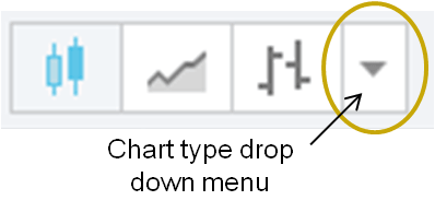
You can choose between 10 different chart types to suit your needs as each one help to analyse the market in a different way.

To choose a specific chart type click on the down arrow next to the bars button
Brief explanations are below on the 5 most commonly used chart types that are and are not time-based:
Renko & Kagi (Not Time-Based)
Renko charts only measure price movement and show if the trend of the price direction is up or down. Unlike Candlestick charts, Renko charts filter out all other variables besides price movement.
This is why Renko charts are popular at discovering basic support & resistance levels, breakouts and generating signals when used with other indicators.
The size of the bricks can be pre-determined by the user and once the price moves more than the defined ‘brick size’ either above or below the most recent brick, then a new brick is added to the chart. New bricks are only added when the price movement completely fills the predetermined brick size.
Kagi charts are similar to Renko charts in that they only show price action. The main difference is that they use lines instead of bricks, so it will be matter of personal preference as to which one you use.
Line Break Chart (Not Time-Based)
This chart also only focuses on price movements. However, the prices it uses are the current closing price versus a previous closing price (normally around 2 closes ago which you can change in the chart settings).
Point and Figure (Not Time-Based)
These charts show price movement as either an ‘X’ for a move up or an ‘O’ for a move down in price.
Each box that the X or O occupies represents an amount of money that the price has moved, such as $5 per X or O (which is user defined). This way you can easily calculate the moves and swings that the current gold and silver prices have had during the day.
Candlestick (Time-Based)
A Candlestick chart will show you how the current gold and silver prices have moved within a certain time period, such as a minute or day.
Comparing Multiple Symbols to the Current Gold and Silver Prices
You can use the current gold and silver prices as a benchmark index and compare the performance of other commodities or indices against it, such as the HUI or silver spot price (XAGUSD).
Percentage Basis
These charts will now compare the price moves of the 2 ticker symbols based on their percentage change since the chosen starting point. It is important that the vertical axis will change from price to percentage because if their actual prices are used and they are too far apart, then the data series will flatten out and the chart will lose its effectiveness.
To use as a percentage comparison basis, click on the 'Compare' button on the top bar and then type in the symbol you want to use.
Actual Price Basis
A popular reason for using the add function is the ability to compare market trends for several similar or related instruments simultaneously. For example, you can analyse two different Gold ETF Funds to spot minor differences.
To use the actual prices, click on the 'Compare' button on the top bar and then choose the 'Add' tab. You then type in the symbol you want to add.
Under the 'Add' tab is the option 'Overly the main chart'. If this is unchecked, the new symbol will not be overlaid on top of the original data series.
Instead it will be sent to a new panel beneath the original one to give a split screen allowing for greater control of each data series. However, you may find it hinder direct visual comparisons.
Create Spread Charts
Spreads are comparisons between a financial instrument and another variable such as the current gold and silver prices. It's an attempt to provide a new perspective of a financial instrument's value and is believed to help to alleviate some risk.
There are many different spread charts available which you can use in the above chart. The 2 most simple and common are:
- Currency conversions
- Comparisons
If you want to try spreads, do the following to create your own custom spread charts:
- Enter the first variable (symbol, number etc.) into the symbol entry window in the upper left hand corner.
- Enter one of the following four operators; (-) for subtraction, (+) for addition, (*) for multiplication or (/) for division.
- Enter the second variable (symbol, number etc.) into the symbol entry window in the upper left hand corner and press the enter key.
The spreads for intra-day charts are calculated by taking the Open, High, Low, and Close of each 1-minute bar and then recompiled into the selected interval. This approach is the only one that results in the correct spread charts you want to see.
Currency Conversions
Multiplying or dividing an instrument by a currency pair will allow you to view the price of the instrument in a different currency.
So, if you want to see the current gold and silver prices in Euros you type in XAUUSD*USDEUR or XAUUSD/EURUSD for gold, or insert XAGUSD for silver- both give the same result.
Comparisons
Common utilisation of spreads is by dividing one instrument by another. This will give you spread value that can be tracked like a single instrument, such as the gold to silver ratio.
To see the gold to silver ratio, type in XAUUSD/XAGUSD and if you want to see silver to gold you simply swap the symbols to be XAGUSD/XAUUSD.
Additional Information Window
On the right of the chart is a column that you can hide / show (click on any button under the 'Tools' heading or the small arrow at the centre of right border of the chart.
In this column I have opted to show the following extra information:
- Details on the Ask-Bid price and the day's price movement of the symbol you have active
- A watch list showing various precious metals that you can keep an eye on or choose to put into the main chart
- An economic calendar showing the main financial events. This will allow you to know what is coming so that you don't miss anything that could impact the prices you are following
Want to Get Technical?
Advanced Price Scaling
You are able to set the price scales to match your type of analysis. You can use:
- Linear
- Percentage
- Log Axis for drastic price movements
There are two separate price scales available to use at the same time - one for indicators and the other for price movements.
The price scale settings are located on the right side of the bottom bar.
Indicators
The chart comes with a library of over 100 pre-built technical indicators, including Volume Profile, Elliot Waves and Bollinger Bands. There are more technical indicators listed than any one person would ever wish to use, so tinker away and find something that suits your needs when assessing the spot price gold chart.
To see the entire library just click on the 'Indicators' button on the top bar and choose what you want to see added to the chart.
Drawing Tools
There are over 50 intelligent drawing tools for you to choose from.
These drawing tools will hopefully help allow you to understand what stock prices are doing and you can track how your predictions for the current gold and silver prices turn out.
Other drawing capabilities include:
- Free-hand drawing
- Writing on the chart
- Dragging trend lines from A to B
- The ability to apply Fibonacci and Gann tools, plus others
For general daily use, you will find a better overview for the current gold and silver prices, other precious metals, markets and currencies in general on our main spot prices summary page.
Authored by David Gibson:
Authored by David Gibson:


